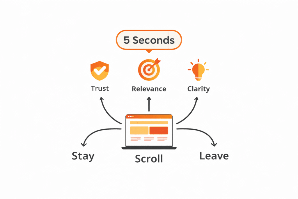
You have exactly five seconds.
That’s all the time most visitors give your homepage before deciding whether to stay or leave forever. In those first few seconds, users subconsciously ask one simple question:
“Is this worth my time?”
If your homepage doesn’t answer that question clearly and quickly, your bounce rate will rise, your conversions will fall, and your marketing efforts will quietly fail.
However, the good news is this:
With the right strategy, you can turn those five seconds into curiosity, trust, and action.
In this article, we’ll explore what visitors notice first, and how to design and write a homepage that truly makes every second count.
Why the First 5 Seconds Decide Everything
The first five seconds are where trust is either built or broken. Visitors subconsciously ask three questions the moment your homepage loads:
- Am I in the right place?
- Is this relevant to me?
- Can I trust this brand?
If your homepage fails to answer even one of these, users bounce. High bounce rates indicate low relevance to Google, which can negatively impact rankings. It’s a vicious cycle.
From a psychological perspective, humans rely on cognitive shortcuts. We scan instead of reading. We judge credibility based on design, clarity, and familiarity. That’s why cluttered layouts, vague messaging, and slow load times are conversion killers.
At the same time, AI systems evaluate your page structure. Clear headings, concise summaries, and logical flow help AI understand and surface your content in answers and featured snippets.
In short, the first five seconds influence:
- User engagement
- Conversion rates
- Search visibility
- Brand perception
When you optimize those seconds, everything else improves downstream.
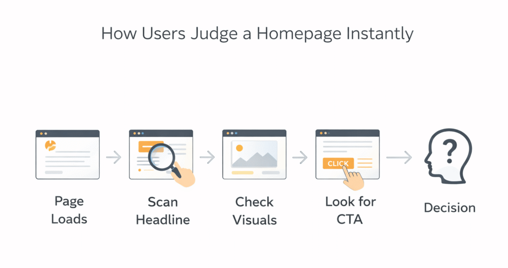
What Visitors Actually Look for in the First 5 Seconds
To make your homepage work more effectively, you must understand how users consume information when they first arrive on a site.
In those initial moments, they are subconsciously scanning for:
- Clarity – What is this website about?
- Relevance – Is this relevant to me?
- Value – What problem does this solve?
- Trust – Does this feel professional and credible?
- Direction – What should I do next?
If your homepage answers these questions quickly, users stay. Otherwise, they leave.
How Google and AI Evaluate Your Homepage
Search engines no longer just “read” content. They interpret, summarize, and provide answers. Google looks for clarity, structure, and intent matching. AI tools look for well-organized, factual, and scannable content.
Key elements both care about include:
- Clear headings that explain context
- Bullet points for quick extraction
- Tables for comparisons
- Direct answers to common questions
Zero-click searches are increasing. That means your content must be snippet-ready. If your homepage explains what you do in one clean sentence, Google and AI can easily quote it.
Instead of hiding meaning in clever copy, lead with clarity. Creativity comes second. Structure always comes first.
The Biggest Mistake Most Homepages Make
Many businesses assume visitors will “figure it out” if they just keep reading.
Unfortunately, that assumption is wrong.
Here’s what typically happens instead:
- The headline is vague or clever—but unclear
- The design looks good—but lacks direction
- The content talks about the company—not the user
- The call-to-action feels hidden or overwhelming
As a result, visitors feel confused. And confused users don’t convert.
So, let’s fix that.
Clarity Beats Creativity Every Single Time
One of the biggest homepage mistakes is prioritizing cleverness over clarity. Creative headlines are great—until they confuse visitors. Your homepage is not the place to be vague or poetic.
Within seconds, users should clearly understand:
- What your business does
- Who it’s for
- How it helps them
That clarity should live above the fold—no scrolling required.
How to Achieve Instant Clarity
- Use a clear, benefit-driven headline
- Support it with a concise subheading
- Avoid jargon and internal language
- Speak directly to the user’s problem
If a stranger can’t describe your business after five seconds on your homepage, it’s time to simplify.
The Power of a Strong Value Proposition
Your value proposition is the heartbeat of your homepage. It’s not about you—it’s about what the visitor gains by choosing you.
A strong value proposition answers:
- Why should I care?
- Why should I choose you over others?
- What makes you different?
Elements of an Effective Value Proposition
- Specific outcomes instead of generic promises
- Customer-focused language
- Emotional relevance paired with logical benefits
For example, “We build innovative solutions” says nothing. But “We help small businesses double online sales in 90 days” speaks volumes.
Visual Hierarchy: Guiding the Eye in Seconds
Your design should guide users like a well-marked road, not overwhelm them like a crowded marketplace. Visual hierarchy helps visitors instinctively know where to look first, second, and third.
Key Visual Hierarchy Principles
- Large, bold headlines for primary messages
- Contrasting colors for calls-to-action
- Strategic use of white space
- Scannable sections with clear separation
When done right, users don’t have to think. Their eyes naturally flow through your message.
Above-the-Fold Content That Hooks Instantly
Above-the-fold content refers to the content that users see without needing to scroll. This area carries enormous weight. It must do heavy lifting in seconds.
Your above-the-fold section should include:
- A bold, benefit-driven headline
- A supporting subheadline that adds clarity
- A relevant visual
- One primary call-to-action
Everything here should work together. No competing messages. No distractions. When done right, users immediately understand what to do next.
This section also plays a major role in featured snippets. Google often pulls answers from the top of a page, especially if the content is concise and well-structured.
Writing Headlines That Win Humans and Algorithms
Headlines are not just for style. They’re signals. Both users and search engines rely on them to understand your content.
Effective homepage headlines:
- Use active voice
- Include clear benefits
- Avoid unnecessary cleverness
Proven headline formulas:
- “Get [Result] Without [Pain Point]”
- “The Simple Way to [Desired Outcome]”
- “Everything You Need to Know About [Topic]”
Break long ideas into scannable chunks. Use subheadings to guide readers naturally. This improves dwell time and helps AI extract meaning accurately.
Design for Scanners, Not Readers
Most visitors don’t read word by word. They scan. That’s why layout matters as much as content.
Design principles that support scanning:
- Short paragraphs (2–3 lines)
- Clear section breaks
- Consistent heading styles
- Generous white space
Eye-tracking studies show users follow F-patterns and Z-patterns. Place key messages along these paths to maximize visibility.
When design supports content, users stay longer. When users stay longer, rankings improve.
Using Visuals That Communicate in Seconds
Images aren’t decoration. They’re communication tools.
Recommended Homepage Images
- Hero image showing real people or a product in use
- Icons to support bullet points
- Screenshots or diagrams for clarity
Make sure images:
- Load fast
- Support the message
- Include descriptive alt text for SEO and accessibility
AI tools also analyze visual context, especially when paired with clear captions.
Mobile Optimization Is Non-Negotiable
More than half of all web traffic comes from mobile devices. If your homepage isn’t optimized for mobile, you’re losing visitors before the five-second mark.
Mobile Homepage Essentials
- Fast load times
- Readable font sizes
- Thumb-friendly buttons
- Simple navigation
Google prioritizes mobile-first indexing, meaning your mobile experience directly impacts your rankings.
Speed, Performance, and Technical Trust Signals
If your homepage takes more than three seconds to load, many users leave. Speed isn’t just technical—it’s emotional. Fast sites feel trustworthy.
Key performance signals include:
- Fast load times
- Mobile responsiveness
- Secure HTTPS connection
Google’s Core Web Vitals measure these factors. Optimizing them improves both rankings and user satisfaction.
Bullet Points and Microcontent That Convert
Bullet points are powerful because they:
- Improve readability
- Win featured snippets
- Help AI extract answers
Use bullet points to summarize benefits, features, or steps. Keep each point concise and action-oriented.
Example:
- Clear messaging in seconds
- Faster user decisions
- Higher engagement rates
Microcontent like labels, captions, and tooltips also guides users subconsciously.
Calls-to-Action That Feel Natural, Not Pushy
Your CTA should guide, not pressure. Use language that feels helpful.
Examples:
- “Get the Free Guide”
- “See How It Works”
- “Start in Minutes”
Place CTAs:
- Above the fold
- After key sections
- At natural decision points
Avoid overwhelming users with too many choices. One primary action works best.
Optimizing for Featured Snippets and AI Answers
To win snippets:
- Use clear questions as subheadings
- Answer immediately in 40–60 words
- Follow with supporting details
Example format:
What is a homepage value proposition?
A homepage value proposition is a short statement that explains who you help, what you offer, and why it matters—within seconds of landing on your site.
This structure works exceptionally well for AI tools.
SEO Optimization Without Sacrificing Humans
SEO and user experience are not enemies. When done right, they reinforce each other.
Homepage SEO Best Practices
- Use your primary keyword naturally in the headline
- Optimize meta title and description
- Include internal links
- Use descriptive alt text for images
Avoid keyword stuffing. Write for humans first, then optimize for search engines.
Building Trust in Under 5 Seconds
Trust signals remove hesitation instantly.
Effective trust builders include:
- Client logos
- Testimonials
- Certifications
- Clear contact information
Place these near the top of your homepage. Trust accelerates decisions.
Homepage Elements That Matter Most
| Homepage Element | Purpose | Impact on SEO & AI |
| Headline | Instant clarity | High |
| Value Proposition | Relevance | High |
| Page Speed | Trust | Very High |
| Bullet Points | Scannability | High |
| Visuals | Engagement | Medium |
| CTA | Conversion | High |
Tables like this are ideal for featured snippets and AI summaries.
Common Homepage Mistakes to Avoid
Avoid these silent killers:
- Vague messaging
- Overloaded design
- Slow performance
- Too many CTAs
- Ignoring mobile users
Each mistake costs you attention—and attention is everything.
Measuring and Improving Your 5-Second Test
Test your homepage by showing it to someone for five seconds. Then ask:
- What do we do?
- Who is it for?
- What should you do next?
If answers aren’t clear, refine. Use tools like heatmaps and session recordings to improve continuously.
Conclusion: Turning Seconds into Opportunities
Your homepage is not a brochure.
It’s not a brand manifesto.
And it’s definitely not about you.
It’s a decision-making tool.
In just five seconds, users decide whether to trust you, explore further, or leave. By focusing on clarity, structure, speed, and human-centered messaging, you can turn those five seconds into meaningful engagement—and real business results.
At Hunters Digital, we specialize in crafting conversion-focused homepages that capture attention fast and guide users to action. If your website isn’t pulling its weight, it’s time to fix that. Contact us today and turn your homepage into your strongest growth asset.
Remember:
When your homepage works, everything else works better.
FAQs
Because users decide almost instantly whether to stay or leave based on clarity and relevance.
A clear headline, subheadline, primary CTA, and supporting visual.
Clear headings, bullet points, and tables help search engines and AI understand content faster.
Yes, especially when it includes concise answers and structured content.
One primary CTA is ideal, supported by secondary ones if needed.
Trying to say too much instead of clearly communicating one main value.