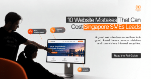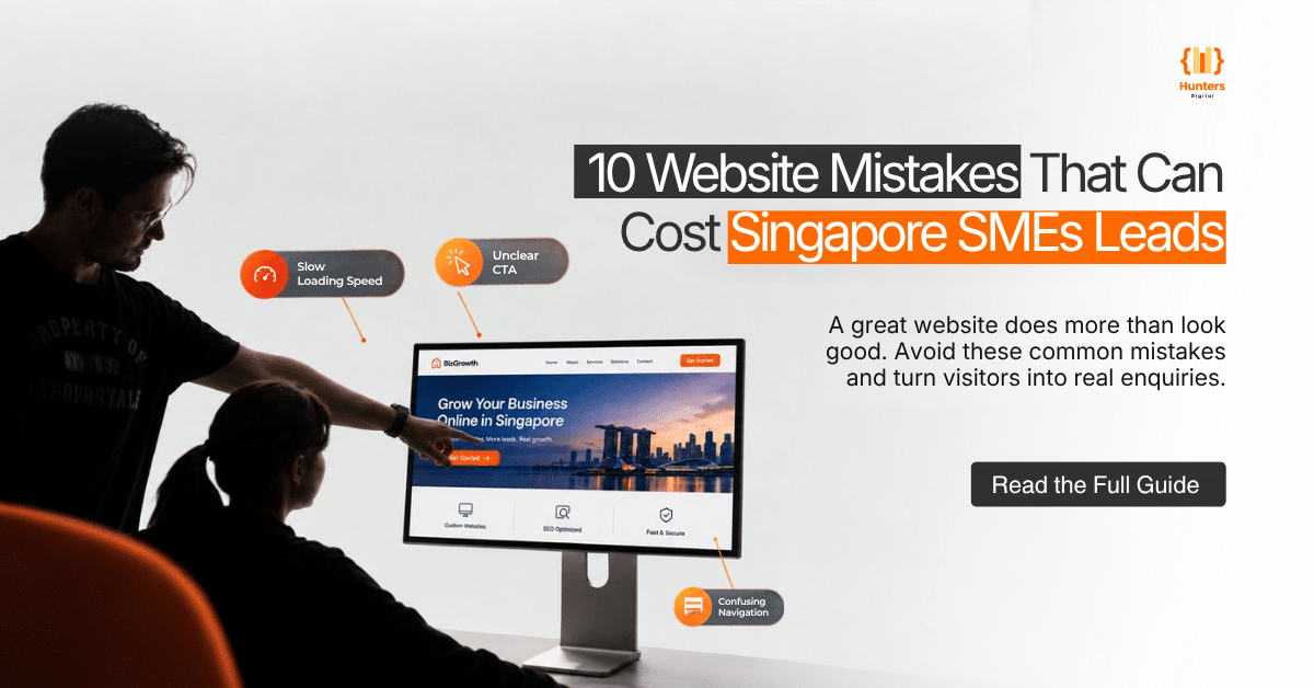
A website does not need to look broken to lose leads.
More often, the problem is smaller: a visitor cannot quickly tell what the business does, a page is frustrating to use on a phone, important information is buried, or the contact process asks for too much before a conversation even starts.
For Singapore SMEs, these small points of friction can have a direct impact on enquiries. A prospect may arrive through Google, LinkedIn, a referral, an email campaign or a paid advertisement, but leave without taking the next step.
The service may be relevant. The business may have the right experience. The visitor simply did not get enough clarity or confidence to continue.
A good business website should do more than look professional. It should help visitors understand the offer, find the information they need, build trust and take an appropriate next step.
Here are ten common website mistakes that can get in the way of that journey.
1. Treating Mobile as the Smaller Version of the Desktop Site
Many websites are designed on a desktop first and treated as mobile-ready later.
The result can be a site that technically works on a phone but is frustrating to use. Text may be too small, buttons may be difficult to tap, menus may take too much effort to navigate and important content may be pushed too far down the page.
This matters because many business searches now happen on mobile devices. A potential customer might discover your company while commuting, checking a recommendation, comparing suppliers or responding to a LinkedIn post.
Google also uses the mobile version of a site’s content for indexing and ranking and recommends responsive web design. It advises businesses to keep important content, headings, metadata and structured data equivalent across mobile and desktop versions.
What to do
Do not check your website only by resizing a desktop browser window. Review the actual mobile experience.
Check:
- Is the main headline easy to read?
- Can visitors understand the service without excessive scrolling?
- Are buttons large enough to tap comfortably?
- Is the navigation easy to use?
- Can visitors call the business directly from their phone?
- Are forms easy to complete on a small screen?
- Are images and videos displayed correctly?
- Are important service details available without relying on hover effects?
Review your homepage, service pages, case studies and contact page on different screen sizes.
A responsive website should not simply fit a smaller screen. It should make the same important information easy to access.
2. Letting Pages Load Slowly or Jump While Loading
A visitor does not experience website performance as a technical report. They experience it as waiting.
Large images, unnecessary JavaScript, third-party scripts, auto-playing videos, excessive animations and poorly configured plugins can all contribute to a slower experience.
Layout shifts can create another problem. A visitor may try to click a button only for the page to move as another element loads.
This is particularly frustrating when the moving element is a navigation menu, enquiry button or form.
Google recommends good Core Web Vitals, secure delivery, mobile usability and a page experience that does not obstruct the main content with intrusive elements. It also makes clear that there is no single page-experience score that guarantees rankings.
What to do
Use tools such as PageSpeed Insights and Google Search Console to identify performance issues on important pages.
Prioritise practical improvements such as:
- Compressing oversized images
- Using appropriate image dimensions and formats
- Removing unnecessary scripts
- Deferring non-essential resources
- Reviewing third-party tracking and marketing scripts
- Improving server response time
- Reducing excessive animations
- Preventing unexpected layout movement
- Testing important pages on mobile connections
Do not optimise simply to achieve a perfect score.
The more useful question is: Can a visitor access and use this page quickly enough to complete the task they came to do?
3. Making Visitors Work Out What You Do
One of the most common website problems is unclear messaging.
A headline such as “Delivering Solutions for Tomorrow” may sound polished, but it does not tell a prospective customer what the company actually does.
A visitor should not have to read three paragraphs, open a dropdown menu and scroll through a banner before understanding the business.
For an SME, clarity is particularly important because the website may be the first substantial interaction a prospect has with the company.
What to do
Make the first section of every important page specific.
Your homepage should make it easy to understand:
- What you offer
- Who you serve
- Where you operate
- What problem you solve
- What the visitor can do next
For example, instead of:
Delivering innovative solutions for modern businesses
A Singapore engineering company could use something more specific:
Industrial Engineering Solutions for Singapore Manufacturers
Then explain what the company provides, who it works with and how prospects can start a conversation.
The same principle applies to service pages.
A visitor should be able to understand the purpose of the page from the headline, supporting copy and first section without having to decode industry jargon.
4. Using Vague or Weak Calls to Action
A website can explain a service clearly and still fail to generate enquiries because the next step is unclear.
Generic buttons such as “Submit”, “Click Here” or “Learn More” are not always wrong, but they provide limited information about what happens next.
A stronger CTA gives the visitor an idea of the action and, where appropriate, the value of taking it.
What to do
Match the call to action to the page and the visitor’s decision stage.
For example:
- Service page: Discuss Your Project
- SEO page: Request an SEO Consultation
- Web design page: Plan Your New Website
- Case study: Discuss a Similar Project
- Contact page: Send an Enquiry
- Product page: Request a Quote
Do not turn every section into a sales pitch. Instead, place CTAs where they naturally follow useful information.
A service page might introduce the problem, explain the service, demonstrate experience, answer common questions and then invite the visitor to discuss their requirements.
Keep one primary action visible on important pages, while allowing secondary actions where they make sense.
5. Building Navigation Around Your Internal Organisation
Your website visitors do not necessarily understand your internal departments, service codes or organisational structure.
A company might organise its business into departments called “Solutions”, “Advisory”, “Enterprise” and “Business Services”. Internally, those labels may be perfectly clear.
To a new prospect, they may mean very little.
Navigation should help visitors make decisions rather than reflect the company’s internal filing system.
What to do
Structure your navigation around the questions a prospect is likely to have:
- What does this company offer?
- Is the service relevant to my needs?
- Can I trust this business?
- Has it worked with companies like mine?
- How can I contact them?
Clear labels are usually easier to understand.
Examples include:
- SEO Services
- Corporate Website Design
- Digital Marketing
- Case Studies
- About Us
- Resources
- Contact
For larger websites, use dropdown menus carefully and avoid presenting visitors with dozens of choices at once.
On long pages, use descriptive headings and internal links to guide visitors towards related services, case studies and contact options.
6. Giving People No Reason to Trust You
A professional-looking website does not automatically create credibility.
A visitor may still ask:
Have they done this before?
Can they actually deliver what they promise?
Are other businesses using their services?
Who is behind the company?
When a website makes strong claims but provides little evidence, visitors have to make the decision based largely on trust.
What to do
Place evidence close to the claims it supports.
Useful trust signals can include:
- Client testimonials
- Verified reviews
- Client-approved case studies
- Relevant certifications
- Industry memberships
- Named team members
- Years of experience
- Project examples
- Clear service areas
- Contact information
- Appropriate business credentials
- Specific, substantiated results
For Singapore businesses, clear local information can also make the company easier to understand and contact. Depending on the business model, this might include the Singapore service area, office information, phone number or WhatsApp contact option.
Avoid unsupported claims such as “Singapore’s leading”, “number one” or “best” unless there is a clear and current basis for making them.
Trust is stronger when the website demonstrates expertise rather than simply claiming it.
7. Turning the Contact Form Into an Interrogation
A contact form is supposed to make an enquiry easier.
Instead, some websites turn it into a long questionnaire.
A prospect may be asked for their name, company, job title, industry, company size, budget, annual revenue, project timeline, address, phone number, email address and a detailed description before they can submit anything.
That may be appropriate for certain high-value sales processes, but it can also create unnecessary friction.
There is another problem: forms can fail silently.
A visitor may submit an enquiry and receive no confirmation. The business may not receive the notification. A form may work on desktop but fail on mobile.
What to do
Ask only for information that is genuinely needed at the first stage.
Depending on the business, a simple form might request:
- Name
- Work email
- Phone number
- Company
- Short project description
Make optional information genuinely optional.
After submission, provide a clear confirmation message or thank-you page so the visitor knows the enquiry was received.
Then test the complete process regularly.
Check:
- Contact forms
- Email notifications
- Thank-you pages
- Phone links
- Click-to-call buttons
- WhatsApp links
- Calendar booking links
- Mobile and desktop submission
Where personal data is collected, include an appropriate Personal Data Protection Act (PDPA) consent or privacy notice based on how the information is being collected and used.
8. Treating SEO as an Afterthought
A website can look excellent and still struggle to attract relevant organic traffic.
This often happens when SEO is considered only after the website has been designed and published.
Common problems include:
- Unclear page titles
- Weak meta descriptions
- Missing or poorly structured headings
- Duplicate content
- Thin service pages
- Weak internal linking
- Pages targeting irrelevant keywords
- Poorly structured URLs
- Important pages that are difficult to crawl
- Content that does not match search intent
SEO should not mean adding keywords repeatedly to every paragraph.
The goal is to make important pages useful for people and understandable to search engines.
What to do
Build SEO into the website structure from the beginning.
Start by mapping important services, products and topics to appropriate pages.
For example, a Singapore digital agency may have separate pages for:
- SEO Services
- Corporate Website Design
- Ecommerce Website Development
- AEO & GEO Services
- Digital Marketing
Each page should have a clear purpose rather than trying to rank for every possible keyword.
Supporting blog content can then answer related questions and link naturally to the relevant service pages.
Google’s guidance for AI features reinforces many of the same fundamentals: crawlable pages, useful text-based content, good page experience and structured data that accurately reflects visible content.
For Singapore SMEs, local relevance should come from useful context rather than repeatedly inserting the word “Singapore”.
Mention relevant service areas, industries served, local operating arrangements, customer needs and market knowledge where genuinely useful.
9. Leaving Outdated Content Live
A website can lose credibility simply by looking neglected.
Imagine a visitor sees:
- An employee who left the company two years ago
- An expired promotion
- An outdated office address
- A service that is no longer offered
- Opening hours that are incorrect
- An old case study presented as recent work
- A downloadable document with outdated information
None of these problems necessarily break the website.
But they can create doubt.
A visitor may reasonably wonder what else on the site is no longer accurate.
What to do
Create a regular website content review process.
Check priority pages for:
- Services
- Product information
- Pricing guidance
- Team members
- Locations
- Opening hours
- Testimonials
- Case studies
- Contact details
- Legal information
- Downloadable documents
- Promotions
- Internal links
Do not update a page simply by changing its publication date.
The content itself should become more accurate, useful or relevant.
For businesses with frequently changing information, assign ownership to someone who can review updates before they become outdated.
10. Not Tracking What Happens After Someone Visits
Website traffic alone does not tell you whether the website is generating business.
A page might receive thousands of visits but produce few relevant enquiries.
Another page might receive much less traffic but generate several qualified leads.
Without conversion tracking, it is difficult to see that difference.
Google Analytics 4 allows meaningful user actions to be marked as key events. Google’s documentation also uses a lead-submission confirmation page as an example for measuring a lead-generation action with the recommended generate_lead event.
What to do
Track actions that matter to the business.
Depending on the website, these might include:
- Completed enquiry forms
- Phone-number clicks
- WhatsApp clicks
- Consultation bookings
- Quote requests
- Important document downloads
- Newsletter sign-ups
- Ecommerce purchases
- Product enquiries
Then connect website data with your lead-handling process.
For example, do not stop at:
“This landing page generated 30 enquiries.”
Ask:
“How many of those enquiries were relevant, and which ones became actual opportunities?”
That distinction can help an SME decide where to invest its marketing budget.
Review the data regularly and prioritise improvements on pages that already attract relevant visitors.
Fix the Journey, Not Just the Page
These ten mistakes are connected.
A fast website with unclear messaging can still struggle to generate enquiries.
A clear service page with no evidence of experience can leave visitors uncertain.
A website with strong traffic but no conversion tracking can leave the business guessing about what is actually working.
That is why website improvement should not focus only on individual pages.
Look at the complete customer journey:
How does the prospect find you?
↓
What do they see first?
↓
Can they quickly understand what you offer?
↓
Can they find evidence that supports your claims?
↓
Can they easily find the right service or information?
↓
Is the next step obvious?
↓
Can they complete that action without unnecessary friction?
↓
Can your team track and respond to the enquiry?
When these stages work together, your website becomes more than a digital brochure. It becomes a practical part of your sales and marketing system.
How Singapore SMEs Can Prioritise Website Improvements
You do not necessarily need to redesign your entire website to improve lead generation.
Start with the pages that have the greatest business value.
Priority 1: Check the pages already receiving traffic
Use Google Analytics and Search Console to identify pages attracting visitors.
Then ask:
- Are visitors reaching the right page?
- Is the page relevant to the search or campaign?
- Is the message clear?
- Is there a useful CTA?
- Is there enough trust information?
- Can visitors contact the business easily?
Priority 2: Check your highest-value services
A service page that represents an important revenue stream deserves more attention than a low-priority informational page.
Review its:
- Search visibility
- Content quality
- Internal links
- Mobile experience
- Page speed
- Trust signals
- CTA
- Conversion tracking
Priority 3: Test the enquiry journey
Try submitting your own form.
Call the business from the website.
Click the WhatsApp button.
Try to book a consultation.
Complete the process on your phone.
You may discover friction that is not visible when simply reviewing the website visually.
Priority 4: Connect website data with actual leads
A website should ultimately be evaluated in the context of business outcomes.
Compare traffic and conversion data with the leads your sales team receives.
This can reveal which pages and channels are attracting attention and which are generating enquiries that are relevant to the business.
A Website Should Make the Next Step Easier
Your website does not need to be perfect to generate leads.
It needs to make the right information easy to find, communicate the value of your services clearly, establish appropriate trust and make the next action straightforward.
For Singapore SMEs, fixing these fundamentals can also create a stronger foundation for SEO, paid campaigns, referrals, social media traffic and AI-search visibility.
The objective is not simply to get more people onto the website.
It is to make it easier for the right visitors to understand the business and take the next step.
Conclusion
A website should do more than look professional. It should help visitors quickly understand your business, trust your brand and take the next step. Every page should make it easier for potential customers to find the information they need and contact your business.
Small issues such as unclear messaging, slow pages, poor mobile usability, outdated content or weak CTAs can quietly turn potential customers away. Fixing these issues can create a smoother journey from website visit to enquiry.
Hunters Digital can review your website’s design, SEO, mobile experience, user journey and conversion opportunities to identify what may be holding your leads back.
Ready to improve your website? Book a free consultation with Hunters Digital and get practical recommendations to make your website more effective at attracting, engaging and converting potential customers.
Frequently Asked Questions
Common mistakes include poor mobile usability, slow page speed, unclear messaging, weak calls to action, complicated navigation, limited trust signals, lengthy contact forms, weak SEO foundations, outdated content and a lack of conversion tracking.
A lead-generating website should clearly explain what the business offers, show why visitors should trust it and make contacting the business easy. Strong service pages, clear CTAs, mobile optimisation, useful content, trust signals and conversion tracking can all support better lead generation.
Many potential customers browse websites on smartphones. If a site is difficult to read, navigate or use on mobile, visitors may leave before making an enquiry. A responsive website helps provide a consistent experience across different screen sizes.
Important website information should be reviewed regularly, especially after changes to services, staff, locations, promotions or contact details. A more comprehensive website audit can also be carried out periodically to identify technical, SEO, UX and conversion issues.
Yes. Website structure, content, page experience and user journeys can be considered alongside SEO from the beginning. Combining SEO and conversion-focused website design can help a business attract relevant visitors and give those visitors a clearer path towards enquiry or purchase.